Radical.Tools, explained
One model of your architecture; every diagram, table and wiki page derived from it. This guide walks through modelling, the six view kinds, milestones, presentations, files, the metamodel editor, the Concept Hub and the AI assistant.
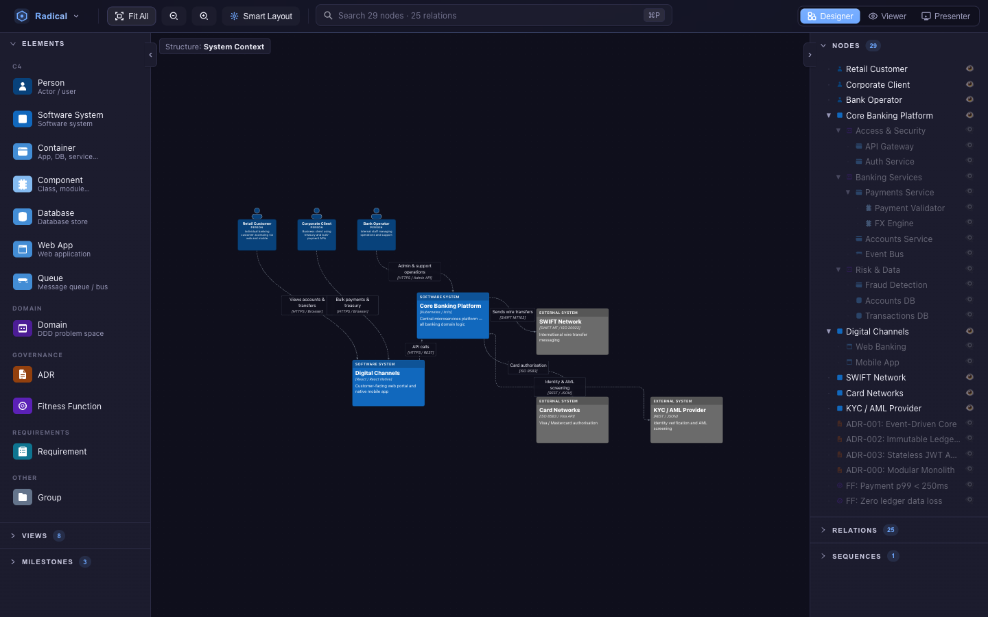
Screenshots follow the theme you pick in the top bar — toggle it to see the other look.
Getting started
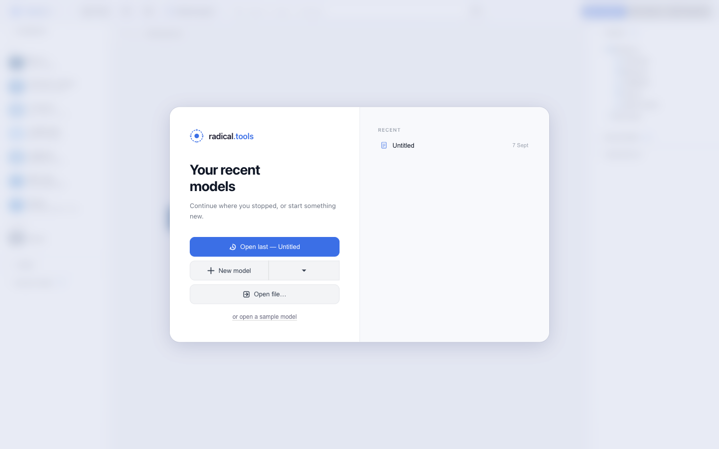
Radical.Tools runs in the browser at studio.radical.tools — no account, nothing uploaded — or as a desktop app (see local install). On first launch you land on the Welcome screen:
- New model — pick the metamodel first: C4, C4 + DDD (adds Domains) or C4 + DDD + Governance (adds ADRs, fitness functions, requirements and blueprints). You can change it later in the metamodel editor.
- Open file — a
.radical/.jsonmodel from disk. - Load the sample — the Fintech Banking Platform used throughout this guide: 62 elements — architecture, ADRs and fitness functions, EARS requirements, Gherkin scenarios and 13 UI mockups with wireframes in three screen flows — 15 views of every kind, four sequences, four milestones and a ready-made presentation.
- Recent — models you already have in this browser.
studio.radical.tools/#/m/designer/v/canvas skips the Welcome screen and opens the last active model directly. See Deep links.
The workspace
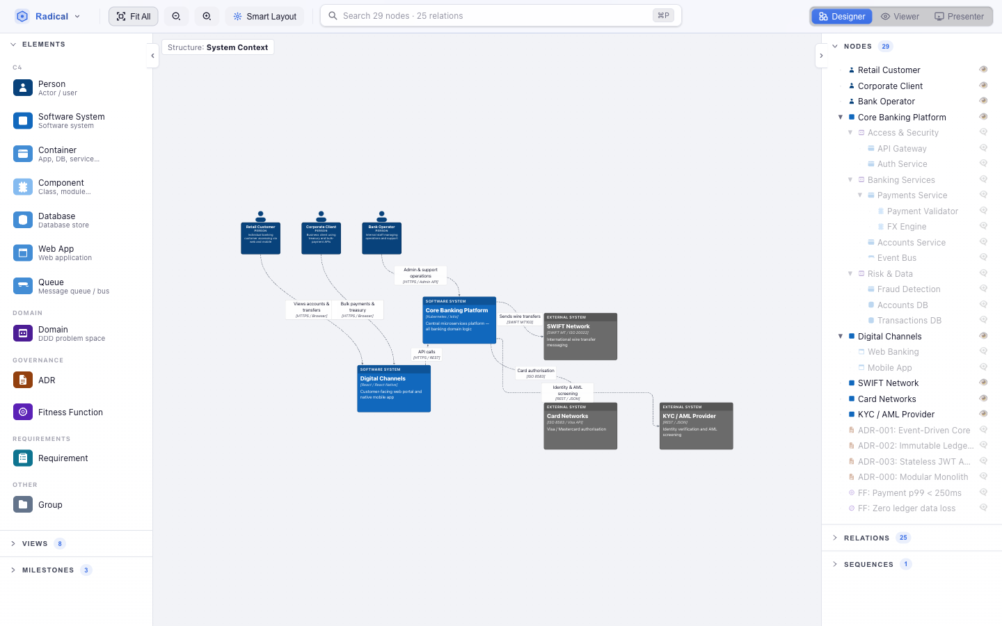
Toolbar
- Radical menu (logo, top-left) — Manage models…, Import from Hub…, Metamodel editor…, light/dark theme, Smart Fit, the connect key, AI providers… and export (PNG, SVG, copy to clipboard).
- Fit All, zoom out / in, Smart Layout (or Tree Layout when the view asks for it), Undo / Redo.
- Quick Search (⌘/Ctrl+P) — find any element, relation or view; doubles as the AI prompt.
- Perspective switch — Designer edits, Viewer explores read-only, Presenter builds and plays slide decks.
Left panel
Three collapsible sections: Elements (the palette — drag onto the canvas), Views (one card per view, with node count and kind) and Milestones. In Viewer and Presenter the palette disappears and Views takes the top.
Canvas
The chip in the top-left corner names the active view (Structure: System Context) or, when time-travelling, the active milestone. Nodes can be dragged, nested, collapsed and connected here; the other view kinds replace the canvas with their own surface.
Right panel
Nodes is the model tree — every element, whether or not the current view shows it; the eye icon toggles visibility in the active view and dimmed rows are outside it. Relations and Sequences follow. Selecting anything slides the panel to its properties.
Models & files
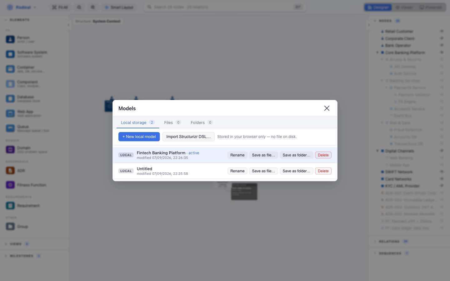
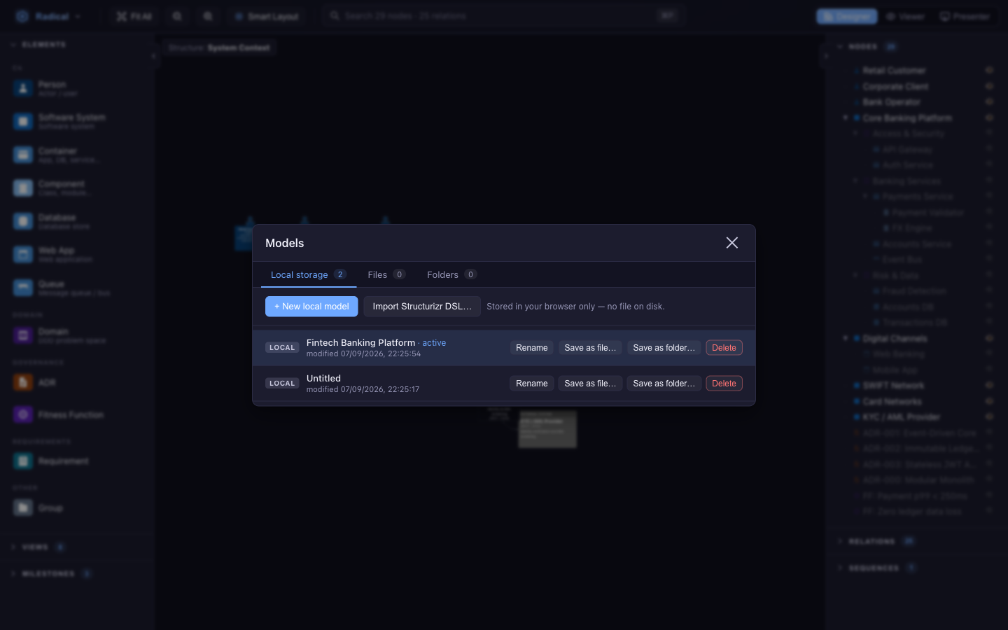
A model is a document. Open Radical menu → Manage models… to see them grouped by where they live:
- Local storage — kept in this browser. Create with + New local model (choose the metamodel), rename, delete, or convert with Save as file… / Save as folder….
- Files — a single
.radicalJSON file on disk (desktop app). - Folders — a Markdown folder: one
.mdper element with YAML front-matter, nested directories for containment, JSON sidecars for layout, views and relations. Diff-friendly and readable without the app. Works in the desktop app and, in Chromium browsers, via the File System Access API (you may be asked to Reconnect a folder after a reload).
Every change is autosaved (a few hundred milliseconds after you stop editing) to wherever the document lives. Import Structurizr DSL… converts a .dsl workspace into a new local model.
radical --file path/to/model.radical (or the RADICAL_FILE environment variable) and the app reloads whenever that file changes on disk — handy next to a text editor or a Git checkout.
Elements
- Drag from the palette onto the canvas. Drop it on top of a container-type node (a system, domain, group…) to make it a child — the parent highlights while you hover.
- Double-click an empty spot on the canvas to create a Software System right there.
- Import from the Hub — see Concept Hub.
The metamodel decides what is allowed. Dropping a Component directly on the canvas, a Person inside a System, or a fourth element of a type limited to three is refused with a message rather than silently drawn — so the model stays valid.
Containment
Change a parent any time with the Parent field in properties, or by dragging the node into another container. Collapse a container with the toggle in its header or in the model tree; children fold away and relations re-attach to the parent. In a named view, collapsing is per view — the same system can be open in one view and folded in another.
Visibility per view
Elements exist once in the model and appear in as many views as you like. Use the eye icon in the model tree (or Hide from view in the selection bar) to add or remove an element from the active view. Ancestors of a visible element are included automatically.
Relations
- Hold the connect key — Alt by default; change it under Radical menu → Connect key.
- Press on the source node, drag to the target, release. A preview line follows the pointer; Esc cancels.
The relation type is inferred from the metamodel (e.g. Interacts between C4 elements, Constrains from an ADR). Pairs the metamodel does not allow are refused. Select an edge to edit its label, technology and relation type in the right panel; the edge action bar under it lets you re-route the source or the target, hide the relation from the active view, or delete it.
Properties & governance
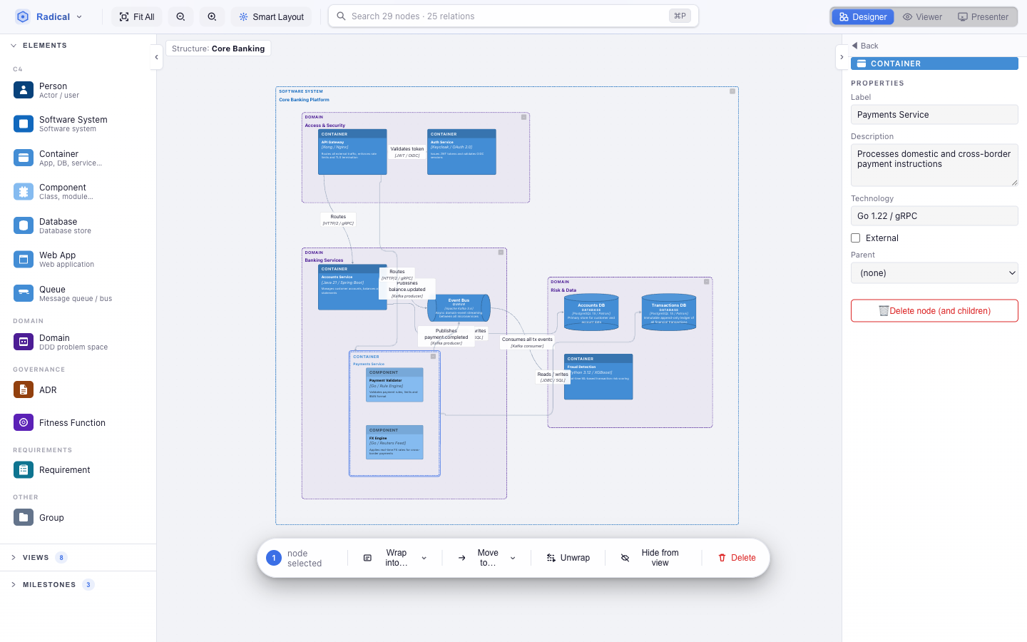
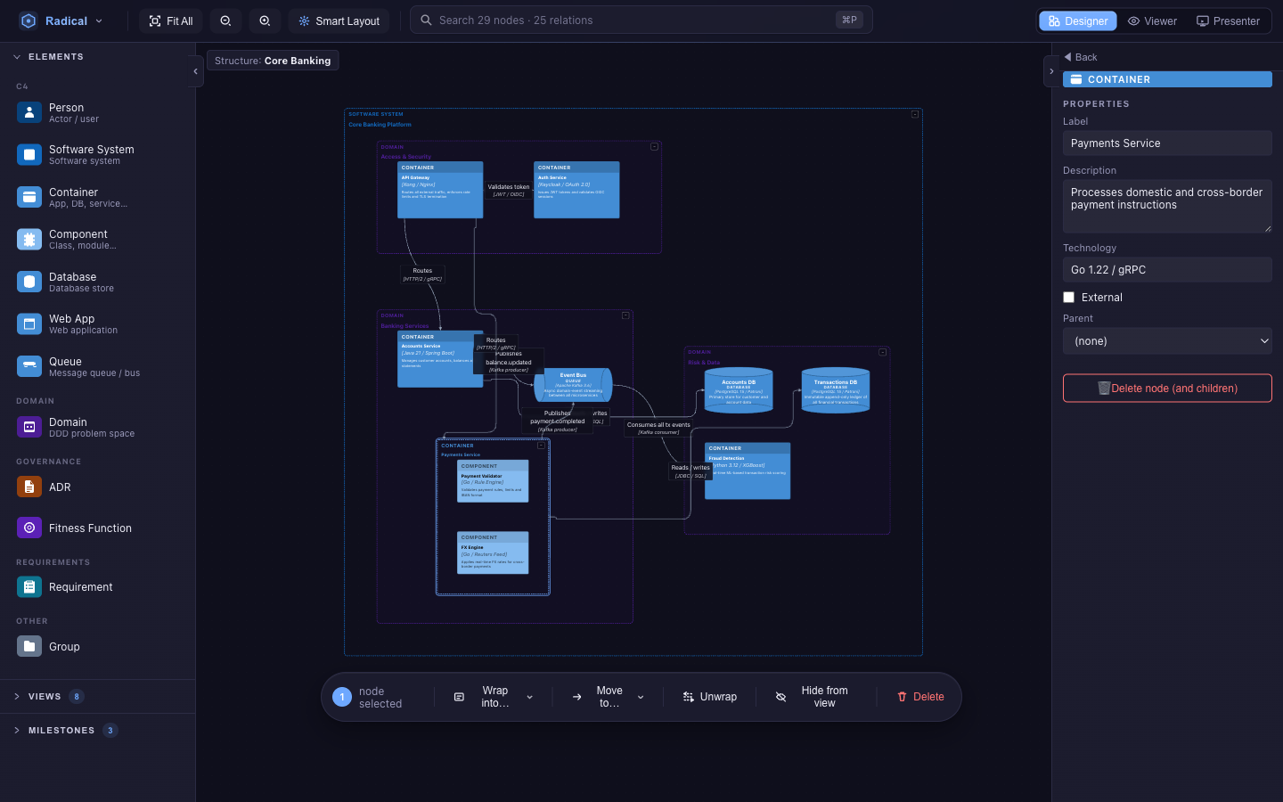
Every element has a label, description and parent; C4 runtime elements add technology and an external flag. Everything else is defined by the metamodel: text, long text, number, boolean and enum fields, optionally shown only when another field has a given value.
Requirements (EARS)
A Requirement is edited as a sentence. Pick the EARS pattern — ubiquitous, event-driven (When …), state-driven (While …), unwanted behaviour (If …, then …), optional (Where …) or complex — and click the highlighted slots to fill trigger, condition and action. Or just type the whole thing into the quick-entry box:
When the user clicks save, the system shall persist the document
…and it is parsed into type, trigger and action. The subject (“the system”) is taken from the element the requirement constrains, when there is one. Status and priority (MoSCoW) are enums.
ADRs and fitness functions
ADRs carry status (proposed → accepted → deprecated / superseded), date, context, decision, consequences and alternatives. Fitness functions carry category, trigger (on deploy / continuous / periodic), an automated flag, threshold and status. Both are ordinary elements: link them with Constrains, Supersedes, Implements, Satisfies, Derives and Traces-to relations to the parts of the architecture they govern, and they show up in the Table, Matrix and Wiki views like anything else.
Wizards
Creating an ADR, fitness function, requirement, scenario or mockup — dropped on the canvas or a table, or added from a wiki page — opens a wizard that walks through its fields one step at a time, with a prompt for each, and ends with the relations that give it meaning (which elements an ADR constrains, which earlier ADR it supersedes…). The element is only created when you press Create (⌘/Ctrl+Enter from any step); Esc discards it. Fill in with wizard… in the properties panel reopens it for an existing element, and Wizard on create in the app menu turns the automatic wizard off. Wizards are part of the metamodel (wizard on a node type), so custom metamodels can define their own.
Mockups & screen flows
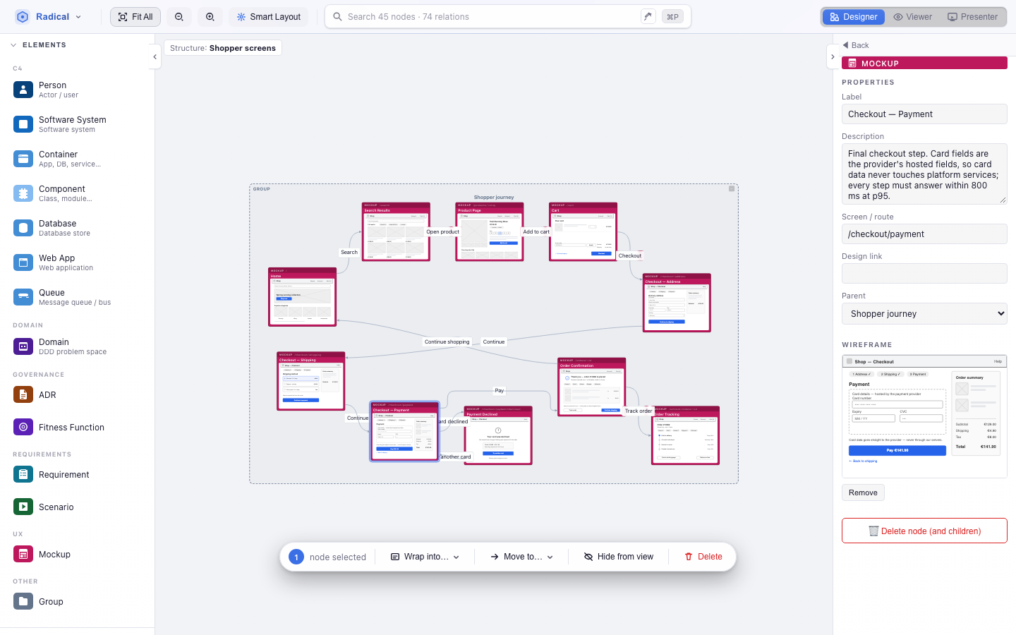
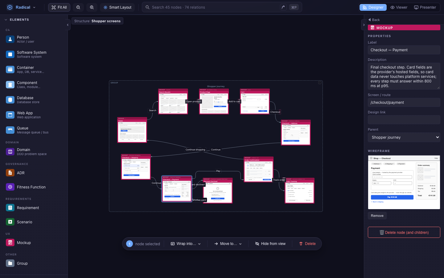
A Mockup (palette group UX) is one screen of the product. Beside label and description it has a Screen / route and an optional Design link to an external design (Figma, Penpot, …). Link it to the rest of the model with three relations:
- Illustrates — mockup → the requirements and scenarios the screen shows.
- Presented by — mockup → the web app or container that renders it.
- Navigates to — mockup → mockup, labelled with the triggering action (Pay, Add to cart). Chains of these are screen flows.
Wireframes
The Wireframe section of a mockup's properties (and of its Wiki page) shows a low-fi wireframe. With AI enabled, Generate wireframe drafts one from the model around the screen: its description and route, the EARS requirements and Gherkin scenarios it illustrates, the container that presents it and the screens it navigates to. Regenerate and Remove do what they say; Open design follows the design link. Wireframes appear as thumbnails on the canvas and on Wiki overview cards.
A wireframe is plain SVG stored on the element. Scripts, event handlers and external references are stripped, and it is only ever displayed as an image, so it can never run code or load anything.
Screen flows
Group the mockups of one actor's journey in a Group (“Shopper journey”) and link the steps with Navigates to, including branches and returns (Payment → Payment declined → try again). Record the steps as a sequence to replay the flow screen by screen in a Flow view or in Presenter.
Working with selections
Click selects one element; Shift, ⌘/Ctrl or Alt-click adds more. With several nodes selected the selection bar appears above the canvas:
- Wrap into… — create a new container of an allowed type around the selection.
- Move to… — re-parent the selection into another container.
- Unwrap — remove a container but keep its children and their relations.
- Hide from view — take the elements out of the active view without touching the model.
- Delete — remove from the model (with children); Delete does the same. Everything is undoable with ⌘/Ctrl+Z.
Views
A view is a named, saved reading of the model: which elements it shows, how they are laid out, where the camera was, and how it renders them. Nothing in a view changes the model; deleting a view deletes no elements.
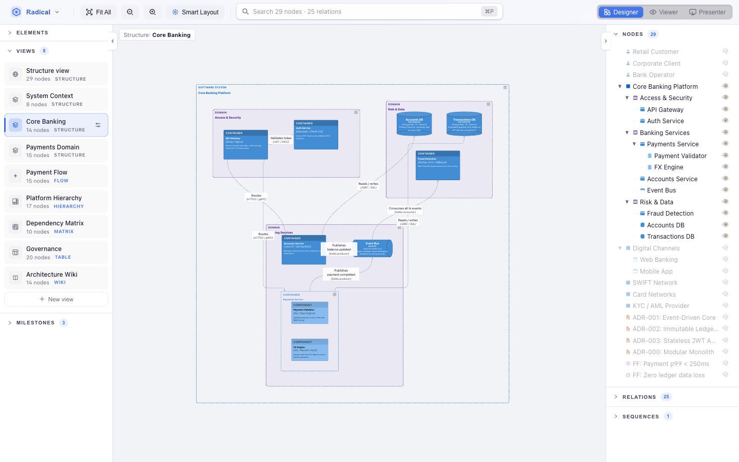
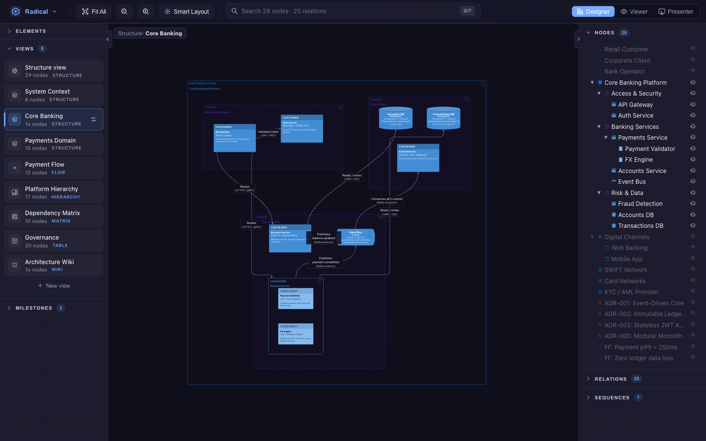
- Create with + New view in the left panel; it starts with the elements currently on screen.
- Open properties (the pencil on the active card) to rename it, change its kind, pick a layout mode (Auto or Tree), link a sequence for Flow views, or tune the treemap.
- Positions, camera and collapse state are per view. Arrange a container map one way and a context diagram another — switching back restores each exactly.
- Hidden relations — a relation can be hidden in one view (edge action bar) while staying in the model and in every other view.
| Kind | What it shows | Best for |
|---|---|---|
| Structure | Node-and-link diagram with nesting | System context, container and component maps |
| Flow | Numbered steps of a sequence between participants | Runtime scenarios, “what happens when…” |
| Hierarchy | Drillable treemap of containment | Portfolio overviews, size and ownership |
| Table | Editable spreadsheet with governance tabs | Bulk editing, ADR and requirement registers |
| Matrix | Dependency structure matrix | Coupling, cycles, who-depends-on-whom |
| Wiki | One document page per element | Reading, reviewing, editing prose |
Structure views
The classic diagram. Relations between elements hidden inside a collapsed container are drawn to the container instead, so a system-level view stays readable while the detail is one click away. Set the view's layout mode to Tree for deep containment hierarchies; the Smart Layout button then runs a top-down tree layout instead of the graph ensemble.
Flow views & sequences
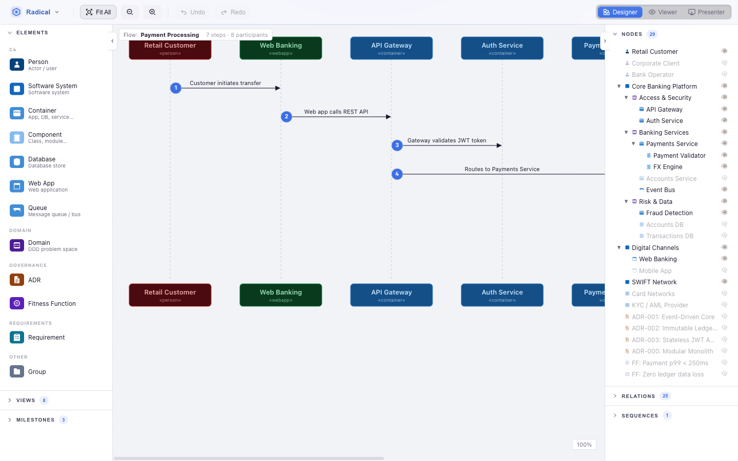
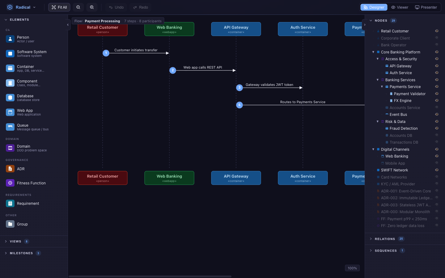
A sequence is an ordered list of existing relations. Open Sequences in the right panel, click + New sequence, then click relations on the canvas to append them as steps. Reorder with the arrows, add a note per step (shown on the arrow instead of the relation label), remove steps, or Create a Flow view for the sequence in one click. A Flow view is linked to exactly one sequence; participants are the elements involved, in order of first appearance. Zoom with ⌘/Ctrl++/−, 0 fits.
Sequences are stored with milestones, so a Flow view can show how a scenario changed over time, and Presenter replays them step by step.
Hierarchy views
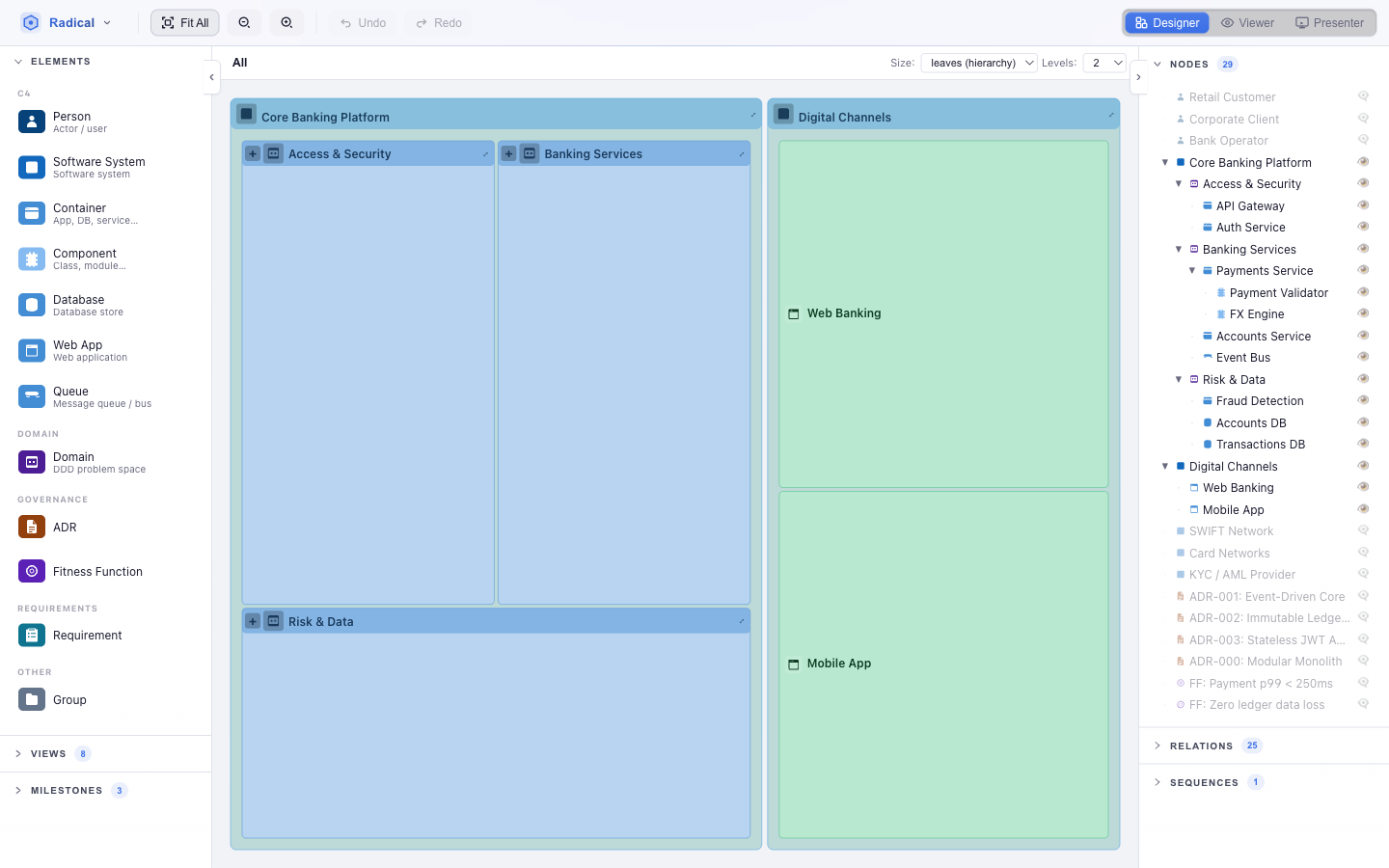
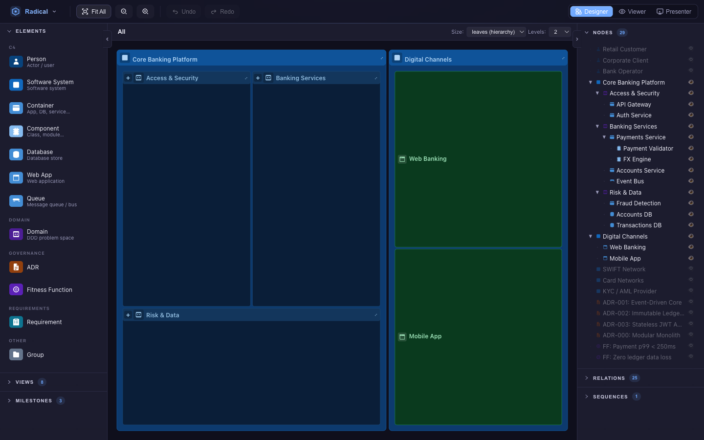
- Size — Leaves (area ∝ number of descendants), Uniform (siblings equal) or Relations (area ∝ connectivity).
- Levels — how many levels below the focus to render; expand a single branch inline without changing the limit.
- Drill — click to focus a subtree; Esc or Backspace goes up. Focus and depth are remembered per view.
Table views
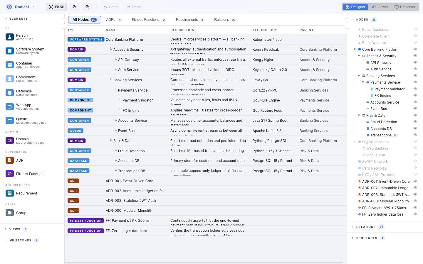
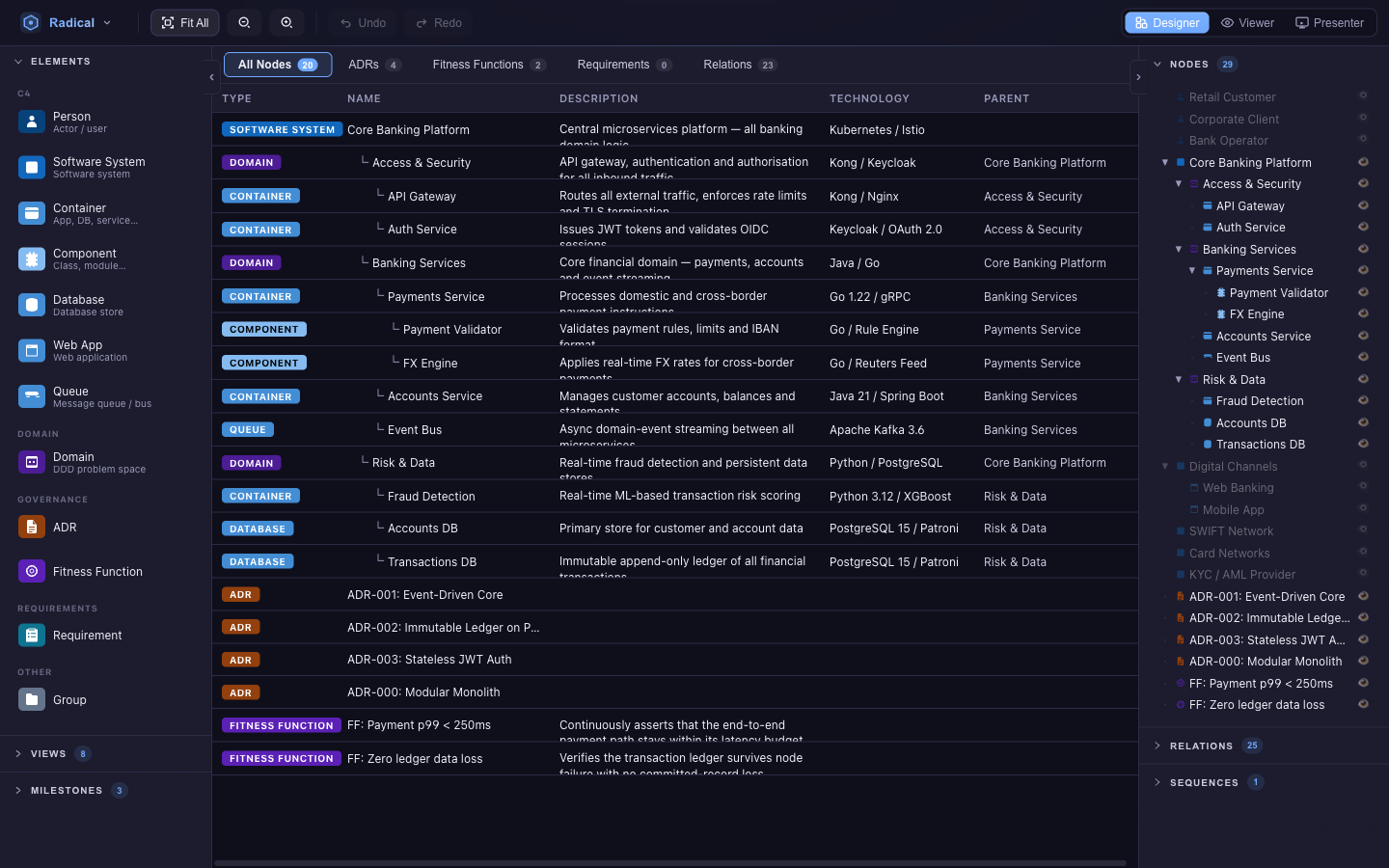
All nodes shows the containment tree as indented rows; ADRs, Fitness Functions and Requirements expose their governance fields (status, priority, EARS pattern and slots…) as columns; Relations lists every edge with source, target, label, technology and type. Click a cell to edit it in place — enums become dropdowns, and columns that depend on another value (an EARS trigger only exists for event-driven requirements) grey out when they do not apply. Drop a palette item onto a row to add a child of that element.
Matrix views
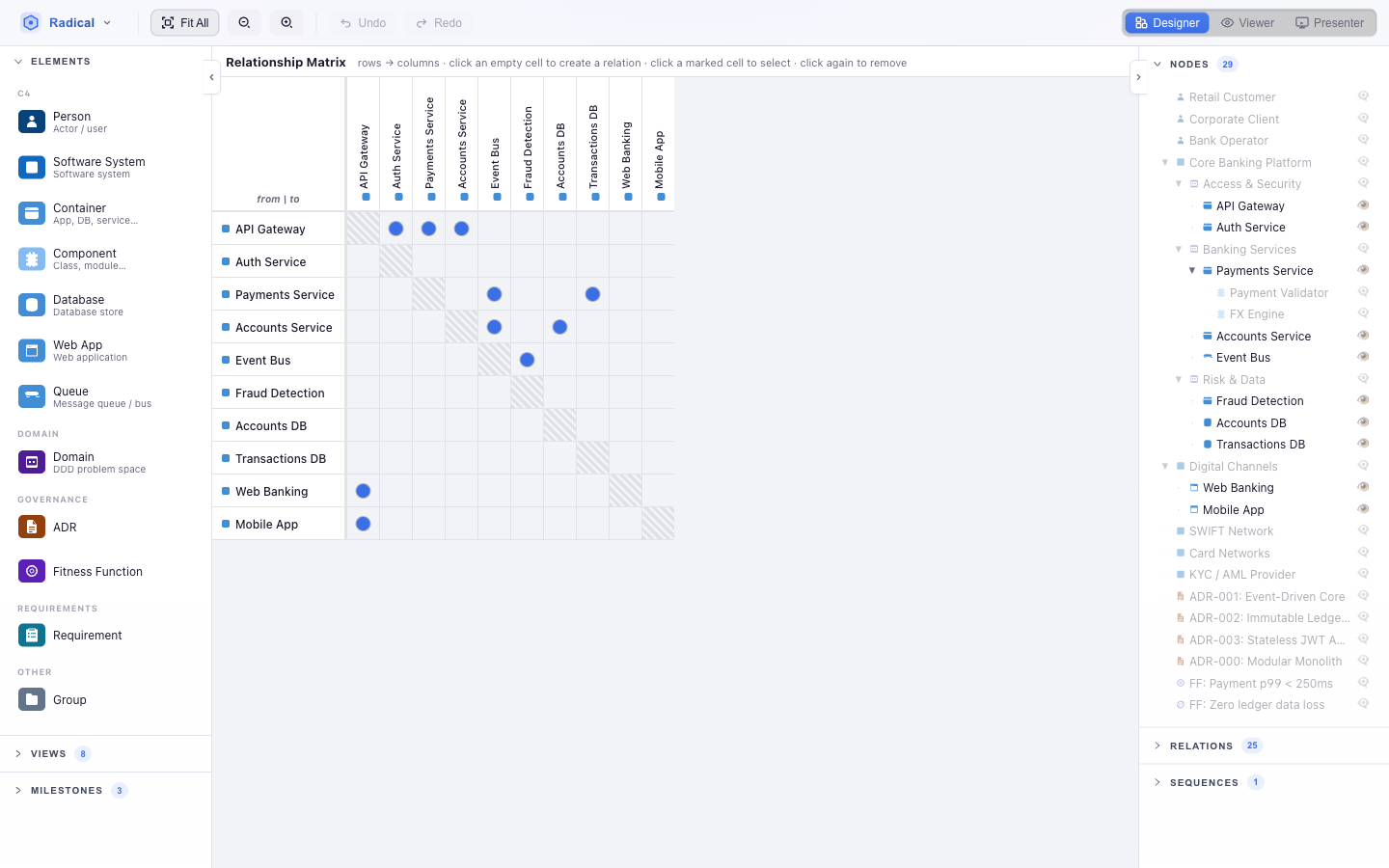
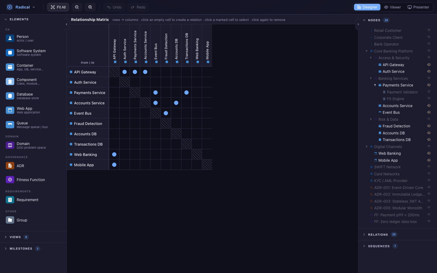
A design structure matrix of the view's elements. A filled cell means at least one relation from the row element to the column element; click it to see which. Because the matrix is just another view, it stays in sync with every diagram — add a relation on a Structure view and the cell lights up.
Wiki views
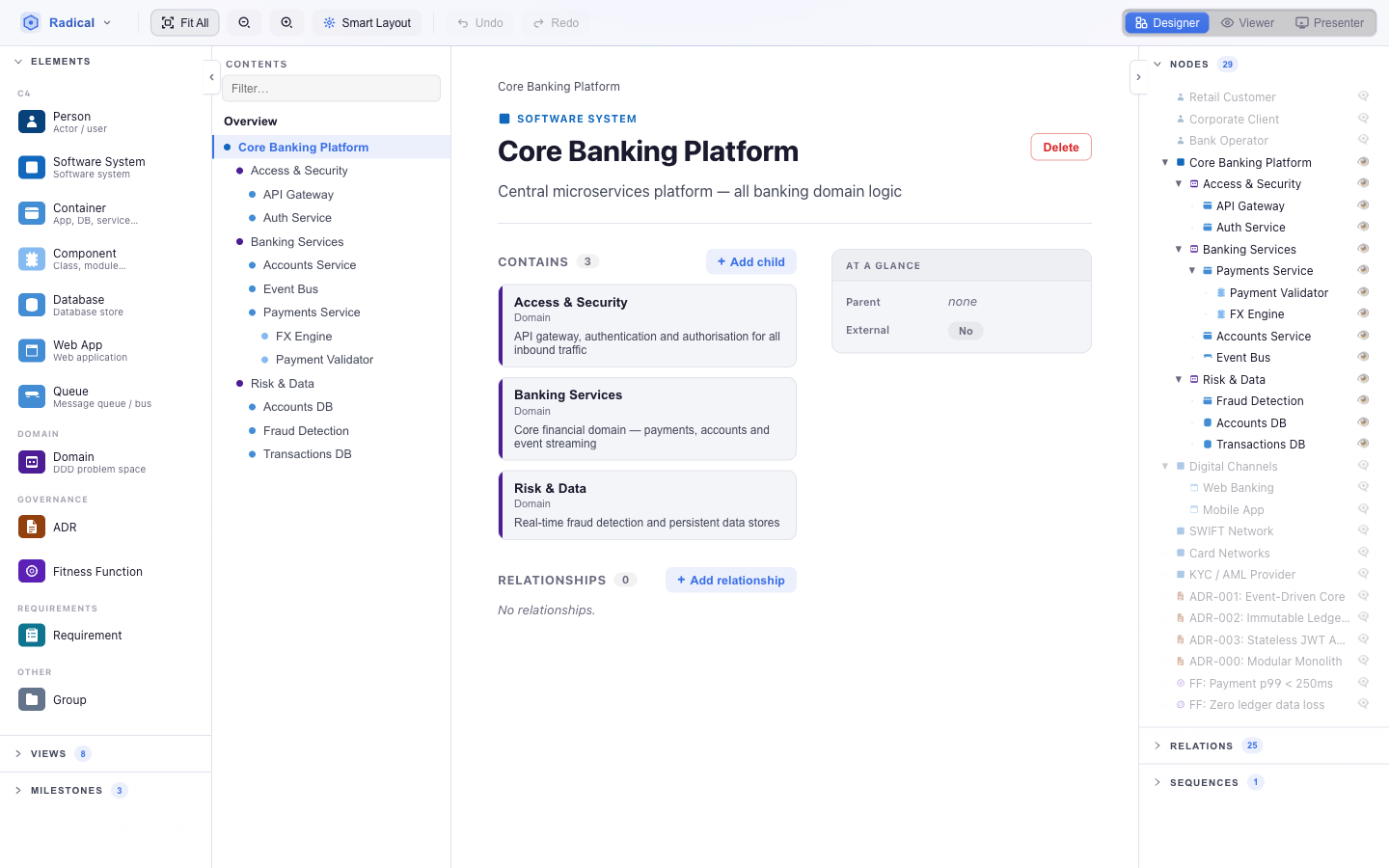
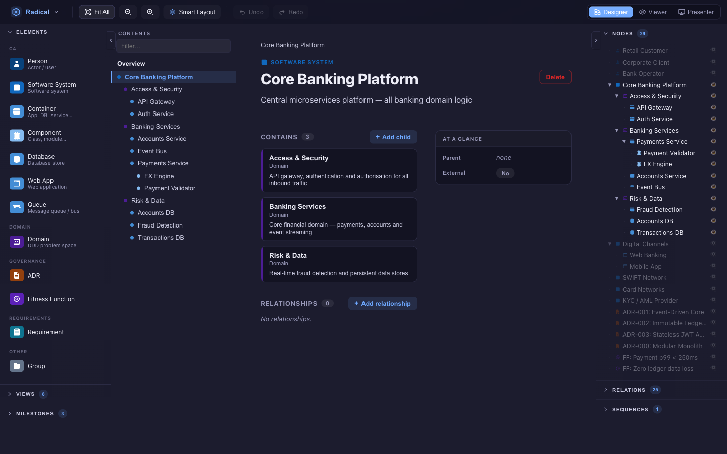
The overview page lists the view's elements as a table of contents; each element page shows its description as prose, short facts (status, technology, priority…) in an infobox, long fields as sections, children, and incoming and outgoing relations as links. Requirements show their EARS sentence with editable slots. You can add child elements and relations directly from a page. The page you are on is saved with the view, so a deep link lands on it.
Layout & navigation
Smart Layout
One button, several algorithms: a layered layout (ELK), a force-directed layout and a simulated-annealing pass are run as candidates, scored for edge crossings, overlaps and compactness, and the best one is applied — with edge routing cleaned up afterwards. It respects containment, so children are arranged inside their parents. A view with Tree layout mode gets a hierarchical tree layout instead.
Live physics
While you drag, a light force simulation nudges neighbours out of the way and keeps containers hugging their children. It never fights you: the node you hold stays where you put it.
Fit & Smart Fit
Fit All frames the visible elements. Smart Fit (Radical menu) keeps the camera fitted as the diagram changes — useful while importing or laying out, less so while hand-arranging. Scroll to zoom, drag the background to pan.
Quick Search
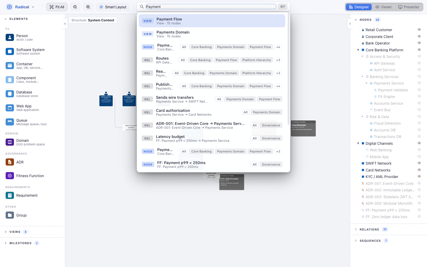
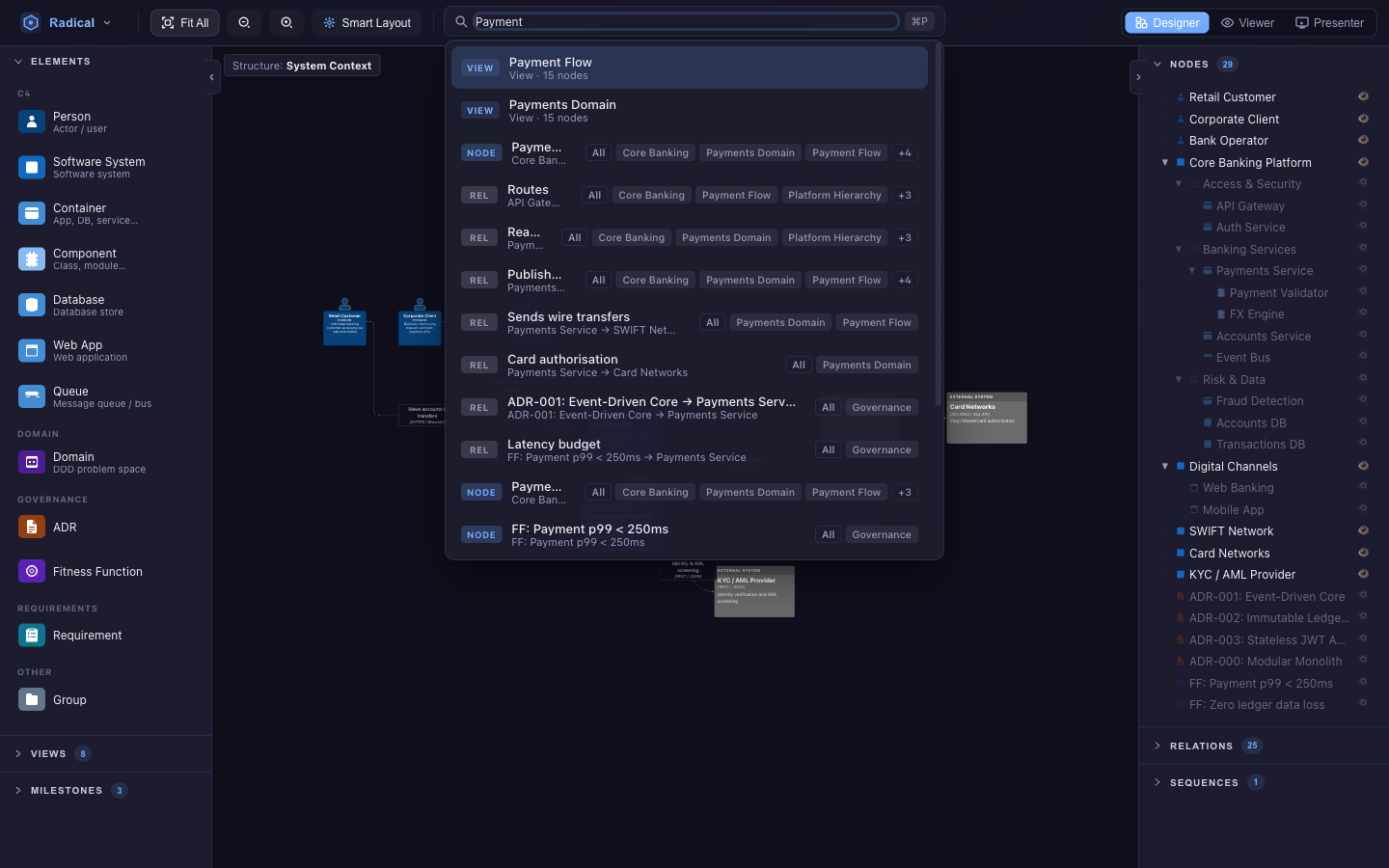
Results are ranked across labels, descriptions and technology. ↑/↓ to move, Enter to select and centre the camera on the element, Esc to close. With an AI provider configured the same box becomes the assistant (see AI assistant).
Milestones
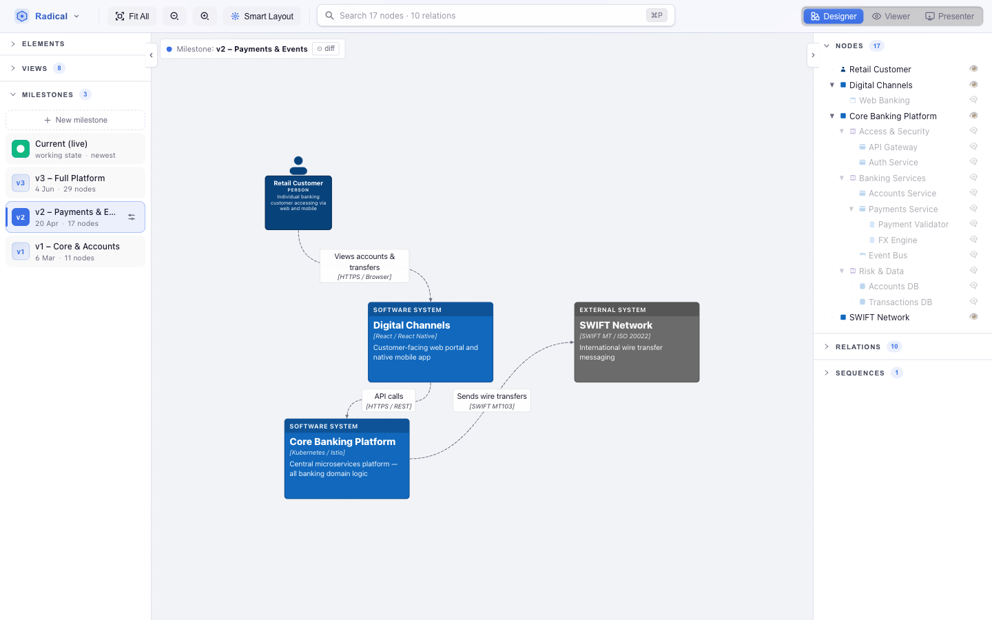
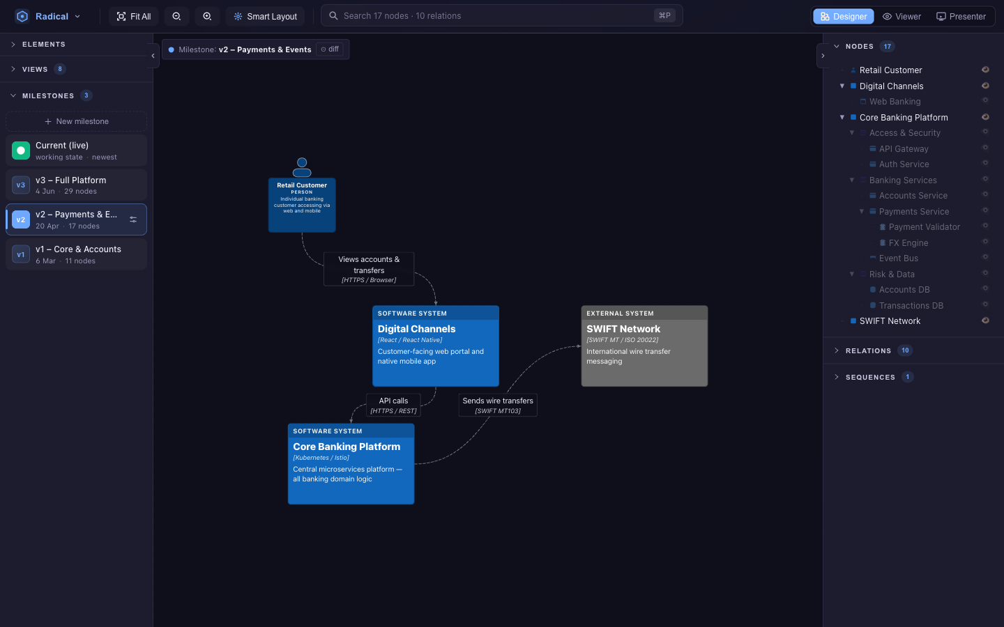
A milestone is a named, dated snapshot of the whole model — elements, relations and sequences. Click + New milestone in the left panel to capture the current state. Click any milestone to step back in time: the canvas shows the model as it was, the chip at the top names it, and every view still works.
- Diff — the toggle on the chip colours what changed since the previous milestone: added, changed, and removed elements drawn as ghosts. Flow views show removed steps the same way.
- Editing in the past — if you change something while a milestone is active you are asked what you meant: propagate the change to that milestone and every later one, save as a new milestone right after it, or discard.
- Slides can be pinned to a milestone, so a presentation can tell the story in order.
Viewer & Presenter
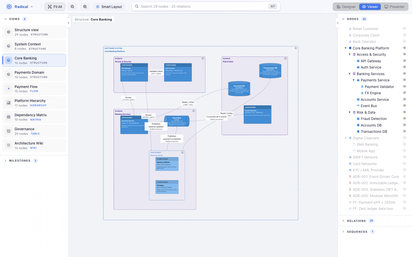
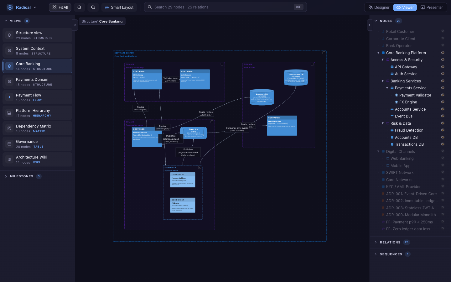
Viewer is a sandbox. Drag, collapse, re-layout, switch views and milestones — all of it is thrown away when you return to Designer, so you can explore freely in front of others. It is also the perspective the Hub uses to show concepts.
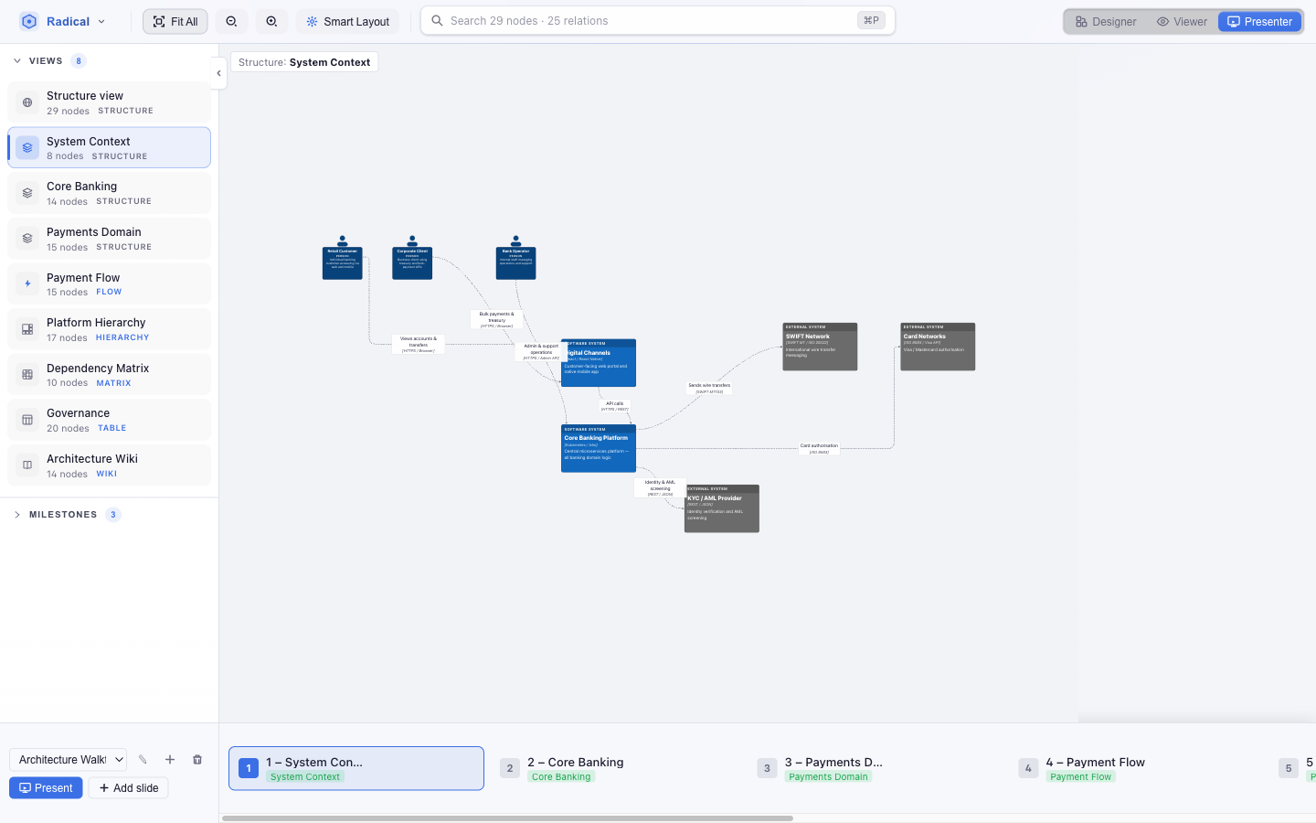
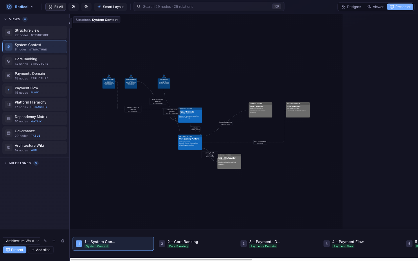
Presenter adds the slide dock. Pick or create a presentation, then Add slide to capture what is on screen: the view, the camera, the layout and collapse state, and the model at that moment. Slides can be renamed, reordered, re-captured, and linked to a view or a milestone. Present (or F5 from anywhere) goes full-screen: → ↓ Space advance, ← ↑ go back, Esc exits. A Flow-view slide replays its sequence one step at a time. The URL updates as you present, so a listener can open the same slide.
Metamodel editor
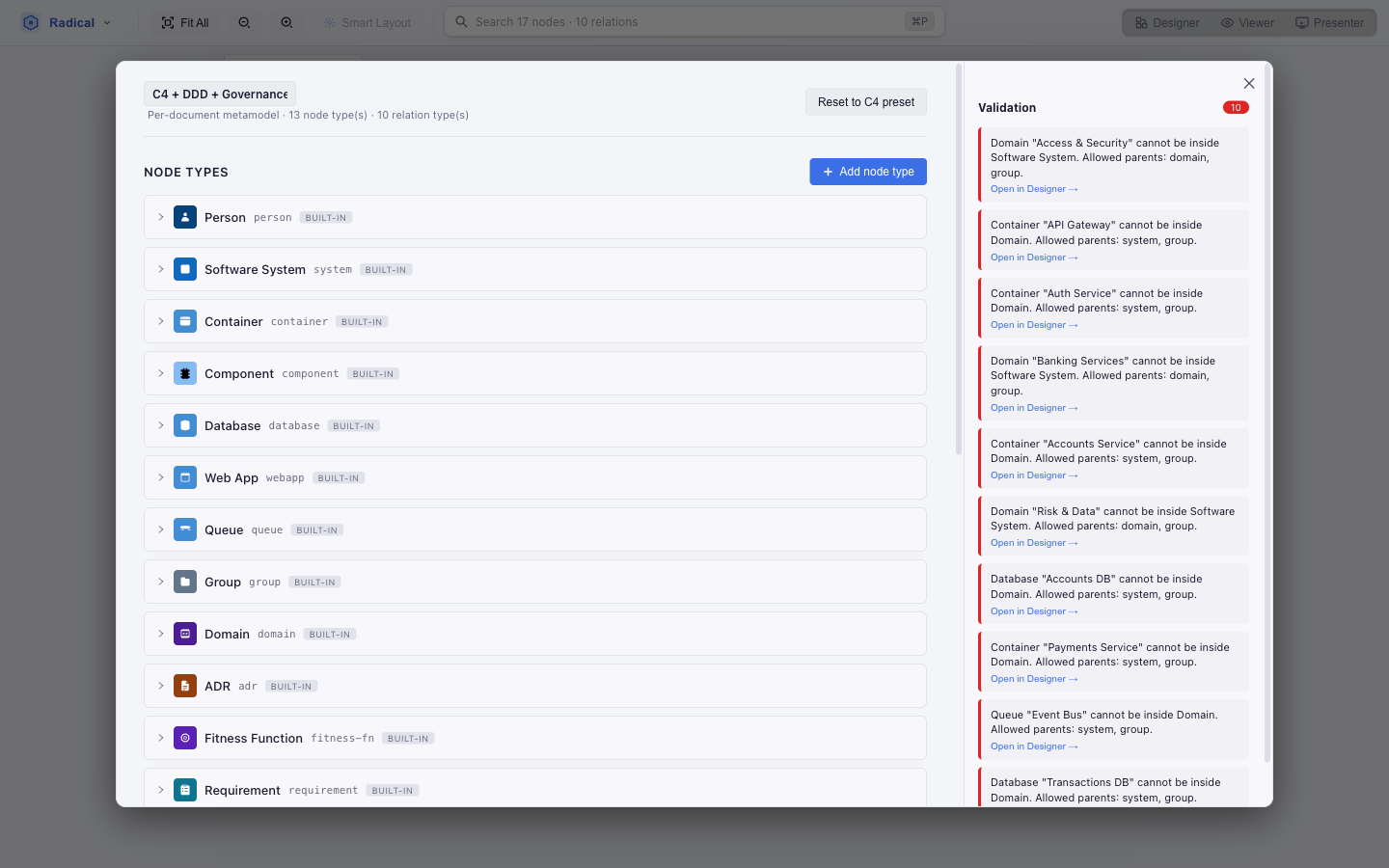
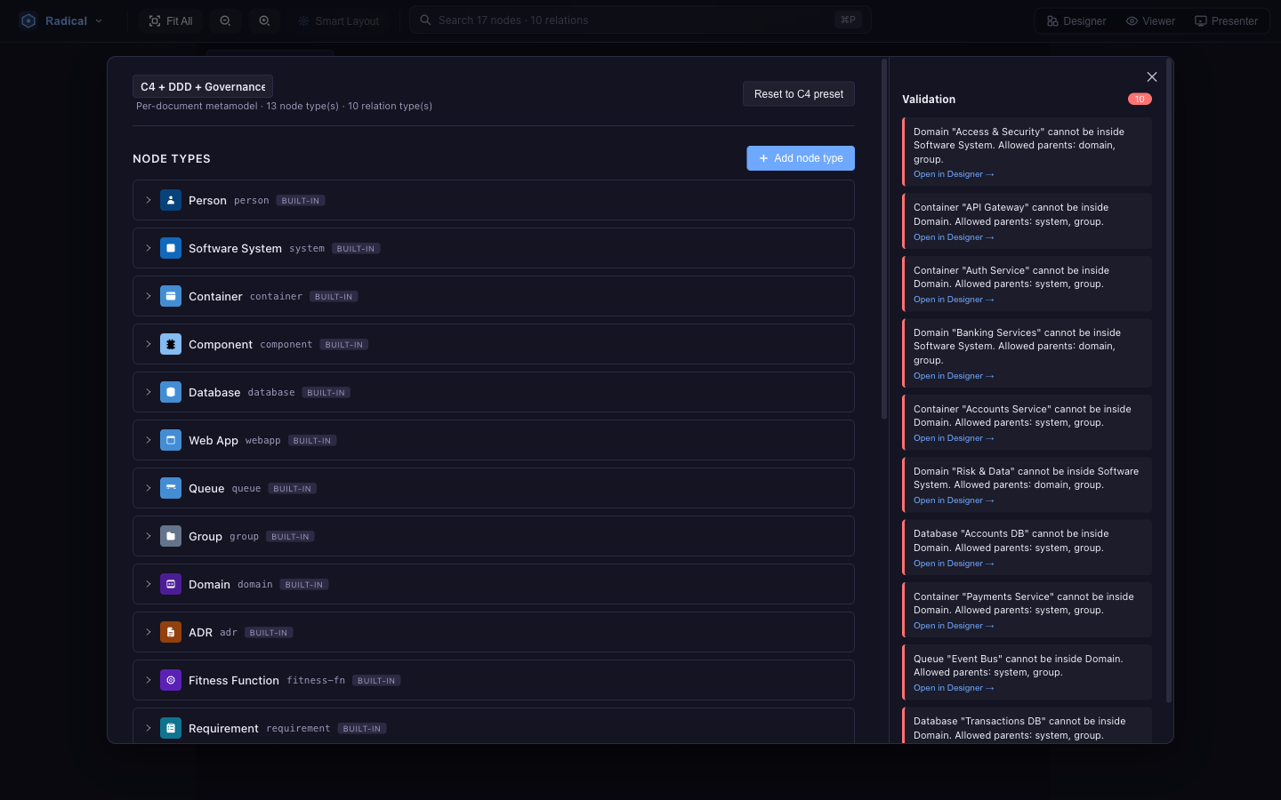
Radical menu → Metamodel editor…. Start from a preset — C4, C4 + DDD or C4 + DDD + Governance — then shape it:
- Node types — label, icon, colour, default and collapsed size, allowed parents, whether it may sit at the root, min/max cardinality, and properties (text, long text, number, boolean, enum with options and a default; a property can be visible only when another one has certain values).
- Relation types — label, colour, the allowed pairs of source and target types, and their own properties.
- Built-in types can be extended but not deleted; add as many of your own as you need.
Validation is live: the palette, the parent drop-down, drag-and-drop and connection previews all consult the metamodel, and the AI assistant's patches are checked against it too.
Concept Hub
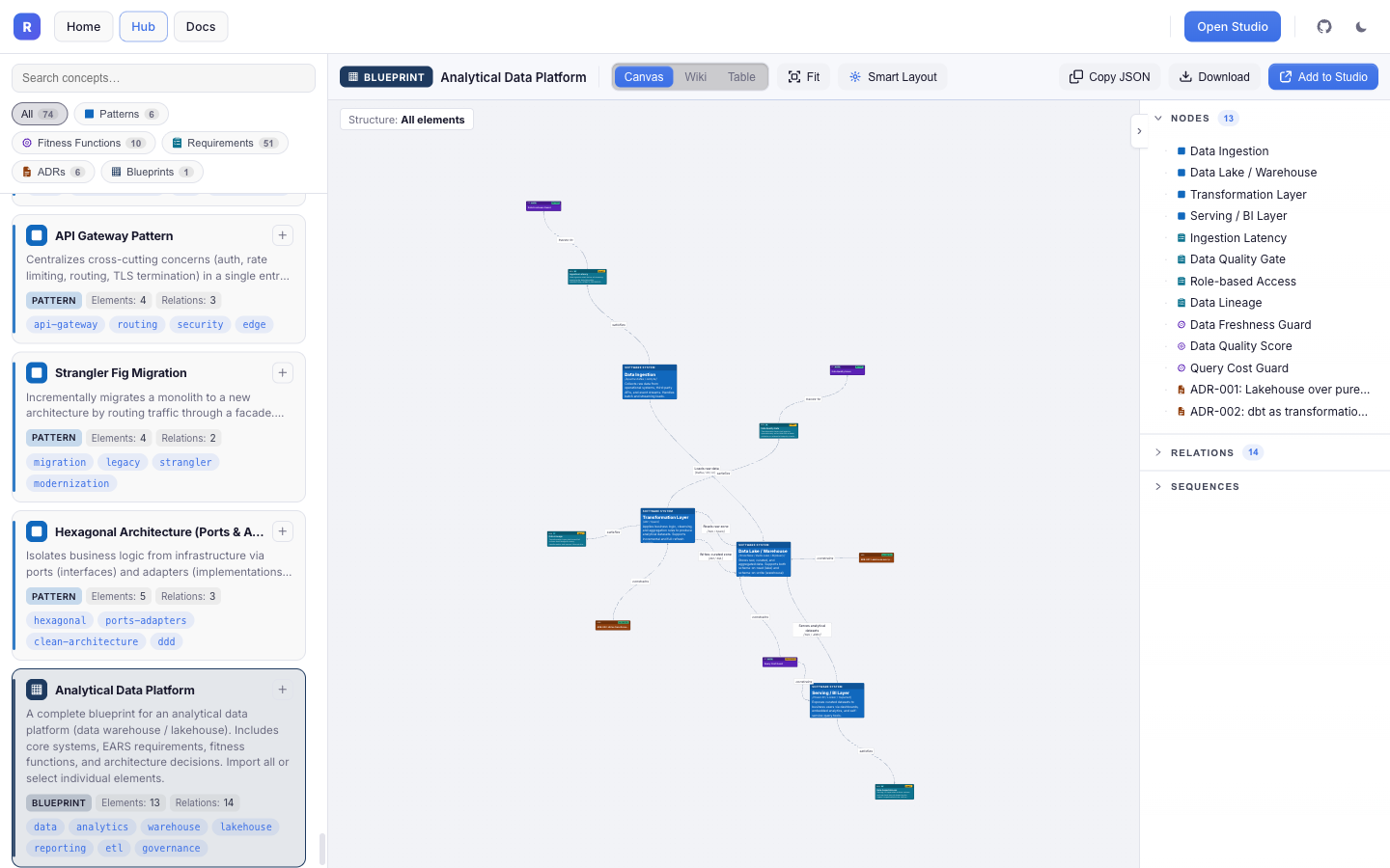
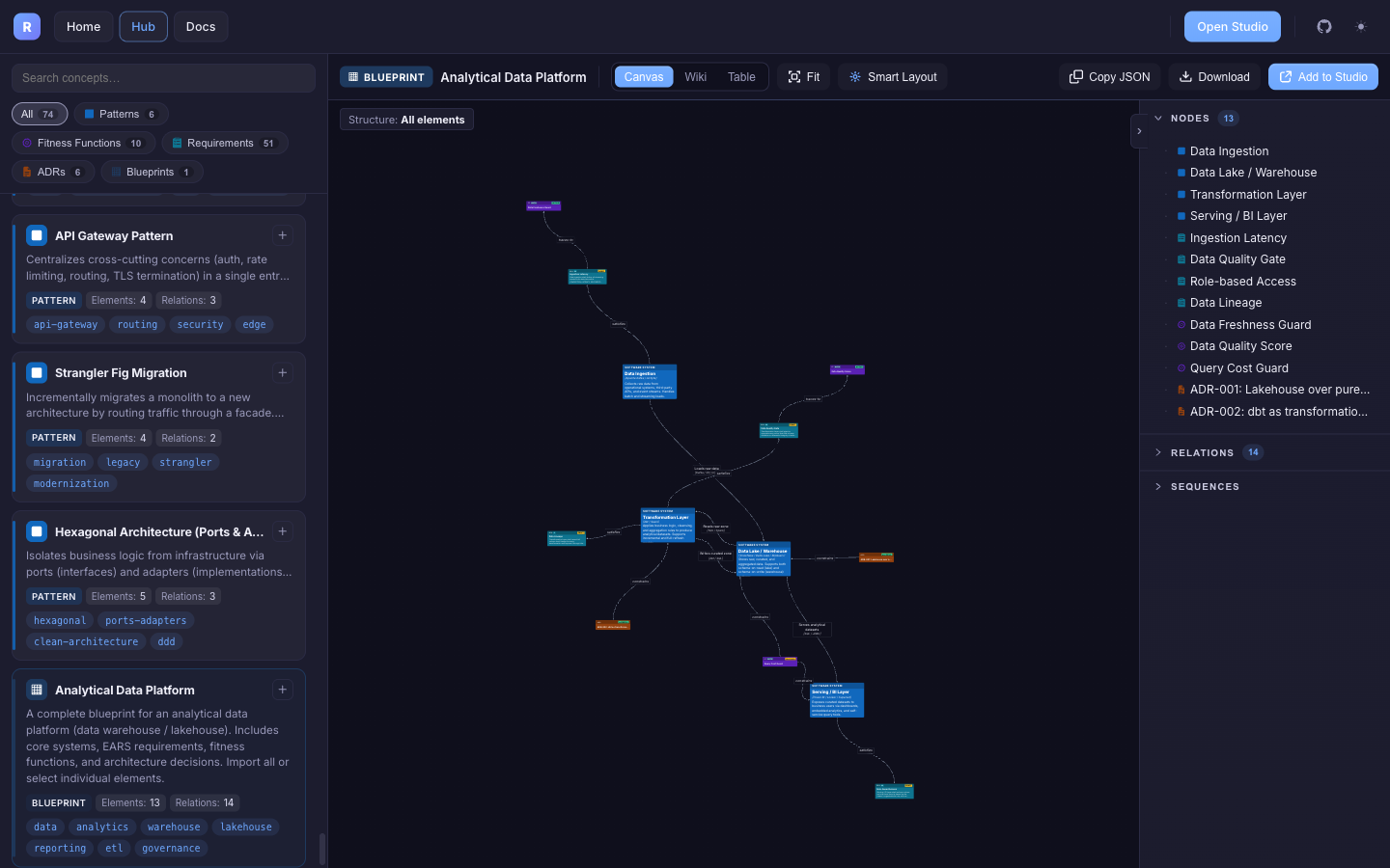
The Hub is a curated library of requirements, ADRs, fitness functions, patterns (C4 fragments) and blueprints (whole solution skeletons). It is rendered by the same engine as Studio, so you can open any concept as a diagram, wiki page or table before importing it. Select several and Add to Studio.
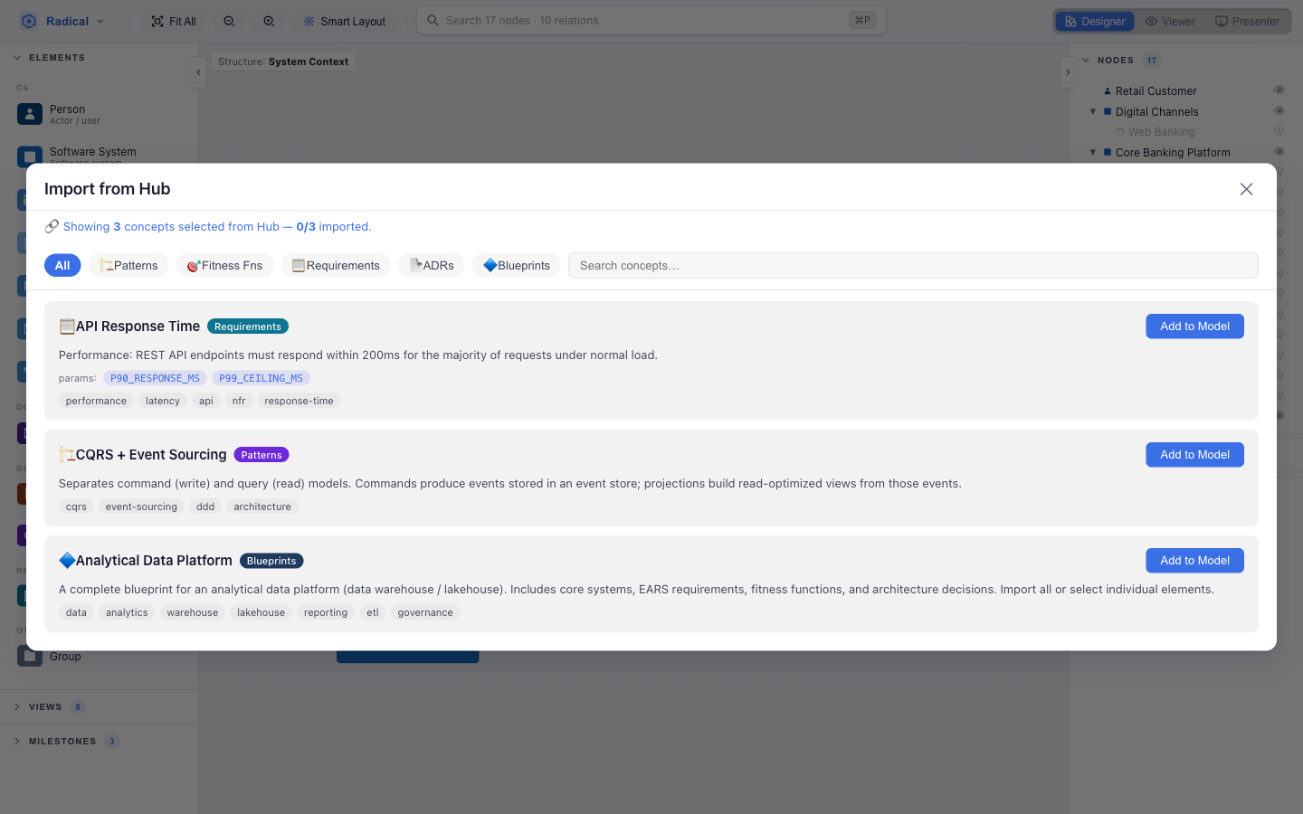
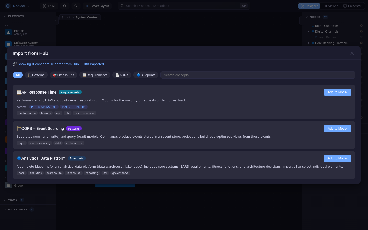
- Templates — concepts with parameters (a latency budget, an endpoint, a data class) ask for values on import; the Hub template section in the element's properties lets you change them later.
- Blueprints — pick which elements and which referenced concepts to bring in. Every blueprint ships one screen flow per actor (mockups with wireframes) and named views: on the canvas System context, Containers, Governance map, Mockups (every screen flow with its wireframes), its technical flow and one Flow view per screen flow; in the wiki Governance and Requirements. In the Hub, the view selector next to Canvas / Wiki / Table lists the views of the current mode; on import they arrive as views of your model, limited to the elements you picked.
- Drop target — with a compatible container selected, imported elements become its children.
AI assistant
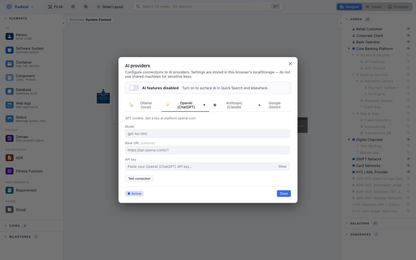
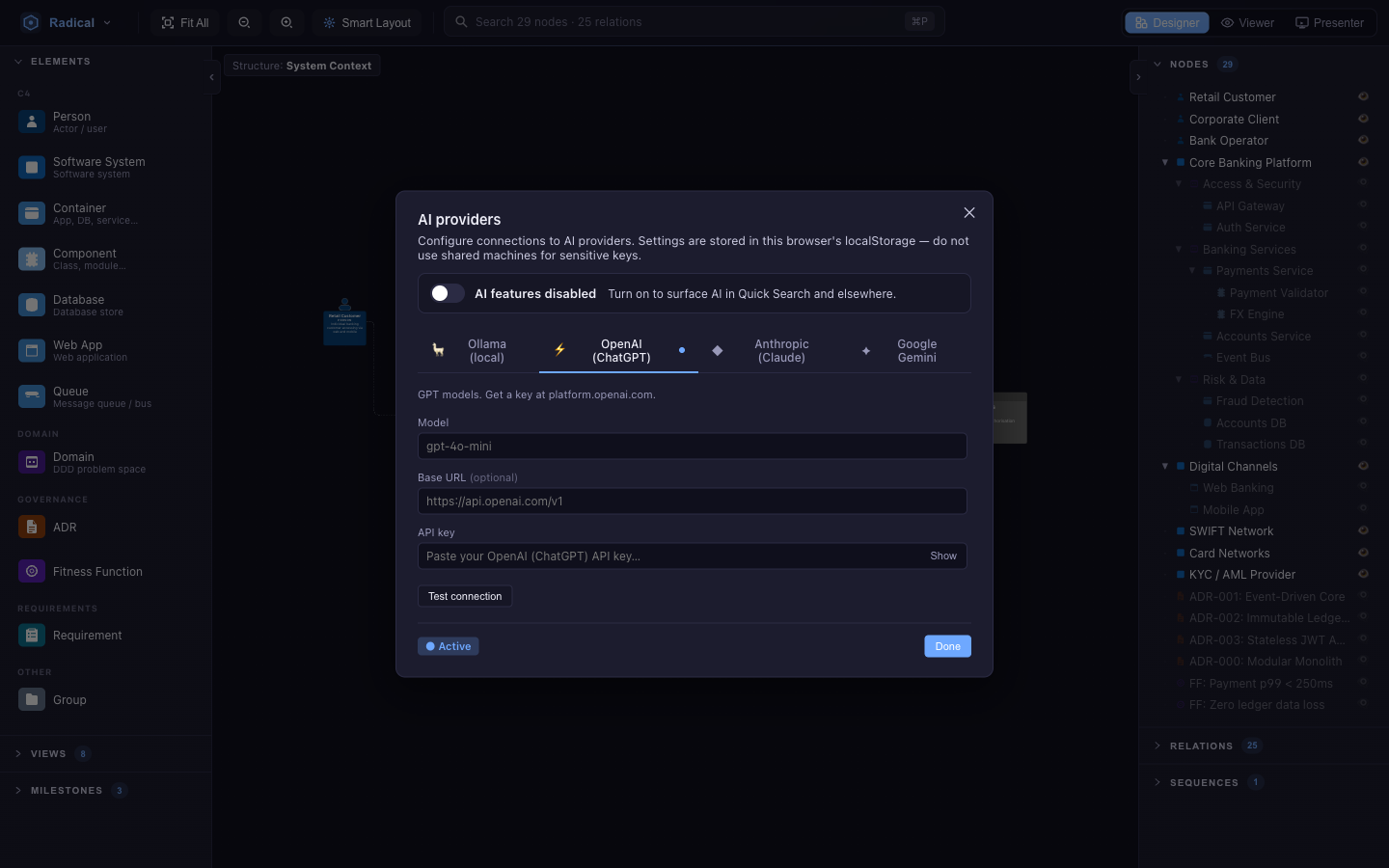
Bring your own model: Ollama (local, no key), OpenAI, Anthropic Claude or Google Gemini. Enable AI, pick the active provider, paste a key, Test connection. Nothing is proxied through radical.tools.
Then open Quick Search (⌘/Ctrl+P) and switch to ✨ AI mode — Tab on an empty box, the ✨ button, or ⌘/Ctrl+Enter to send the current text. The assistant sees the model and its metamodel and can:
- Answer questions — “what depends on the Event Bus?”, “which containers have no owner?”. It queries the model with a small query language (
LIST NODES WHERE …,GET NEIGHBORS,STATS MODEL) rather than guessing. - Change the model — “add a Redis cache between the API gateway and the accounts service”. The answer is a patch (add / update / delete nodes and relations, add views) that is validated against the metamodel, applied atomically and undoable like any other edit.
- Draft governance — turn a paragraph into EARS requirements or an ADR with the right fields filled.
Radical Forge
Radical Forge (Start with Radical Forge on the welcome screen, or Radical menu → Radical Forge…) turns a plain-language description of a system into a model, one reviewable stage at a time: Requirements (EARS) → Fitness functions → Gherkin scenarios → Mockups → C4 model. Each stage may first ask a few clarifying questions, suggests matching Hub concepts, and can be regenerated before you continue.
- Mockups come before C4: the stage creates the user-facing screens with Illustrates and Navigates to links, then Generate wireframes draws a wireframe for every mockup that has none. The C4 stage then designs the front-ends the screens need and links each mockup to its container with Presented by.
- Finish here ends the run at any stage and keeps what has been generated. The final step summarises every stage (what was added, what was skipped) and exports the scenarios as
.featurefiles; ← Back resumes where you stopped.
File formats
.radical (JSON)
One file: nodes, relations, sequences, views (with per-view positions and camera), snapshots (milestones), presentations, the metamodel and Hub template records. Older .c4.json files open unchanged.
Markdown folder
my-model/
├─ radical.md                 # manifest
├─ nodes/
│  ├─ retail-customer.md      # one element = one file
│  └─ core-banking-platform/  # containers become directories
│     ├─ _index.md            # the container itself
│     └─ payments-service/
│        ├─ _index.md
│        └─ fx-engine.md
├─ relations.json
├─ views.json · sequences.json · snapshots.json · presentations.json
├─ metamodel.json · hubTemplates.json
└─ _layout.json               # positions & camera — the only noisy file
Each .md has YAML front-matter (id, type, label, then the element's properties, sorted) and the description as body. Hierarchy is the directory tree. Output is deterministic — sorted keys, stable file names — so Git diffs show what changed and nothing else. Edit the files by hand; the app picks them up.
Deep links
Studio mirrors its state into the URL hash so any screen can be bookmarked or shared:
#/m/<mode>/v/<viewId>[/f/<elementId>][/s/<milestoneId>]
#/d/<docId>/m/<mode>/v/<viewId>[/p/<presentationId>/play/1/sl/<n>]

mode   designer | viewer | presenter | metamodel
view   a view id, or canvas for the default Structure view
f      element page (Wiki views)      s   active milestone
p / sl presentation and 0-based slide while presenting
d      ls:<uuid> or fs:<path> — which model (local to this machine)
The Hub uses #/c/<conceptId>/v/canvas|wiki|table (plus /cv/<viewId> for one of a concept's named views) and studio.radical.tools/?hub=id1,id2 opens Studio with those concepts queued for import.
Keyboard shortcuts
| Keys | Action |
|---|---|
| ⌘/Ctrl+P | Quick Search (and AI prompt) |
| Tab / ⌘/Ctrl+Enter | In Quick Search: switch to AI mode / send to AI |
| ⌘/Ctrl+Z · ⌘/Ctrl+⇧+Z or Y | Undo · Redo |
| Alt + drag (configurable) | Connect two elements |
| Shift / ⌘/Ctrl / Alt + click | Add to selection |
| Delete | Delete selected elements or relation |
| Double-click canvas | New Software System at the pointer |
| Esc | Cancel connection, close dialogs, leave edit mode; in Hierarchy views go up a level |
| F5 | Start / stop the presentation |
| → ↓ Space · ← ↑ | Next · previous slide while presenting |
| ⌘/Ctrl++ / − / 0 | Zoom in / out / fit (Flow views) |
| Enter | Confirm inline edits (names, notes, table cells) |
VS Code & local install
VS Code extension
The Radical extension opens .radical files in a Radical.Tools editor inside VS Code, keeps the file and the editor in sync in both directions, follows the editor's light or dark theme, and offers Radical: Open file and Radical: Open app commands. It ships with the web build embedded.
Desktop app
# Node.js ≥ 18
git clone https://github.com/radicaltools/radical.tools.git
cd radical.tools
npm install
npm run dev              # Electron, hot reload
npm run build && npm start
npm run dev:web          # browser build of Studio
npm run dev:hub          # Architecture Hub
The desktop app adds native file dialogs, Markdown folders without browser permissions and --file watching. Everything else is identical to the browser build.